Tyrock

In the scope of this project I have developed a brand identity including packaging and advertising material for a fictional startup called Tyrock – a company from Tirol, Austria.

Company description

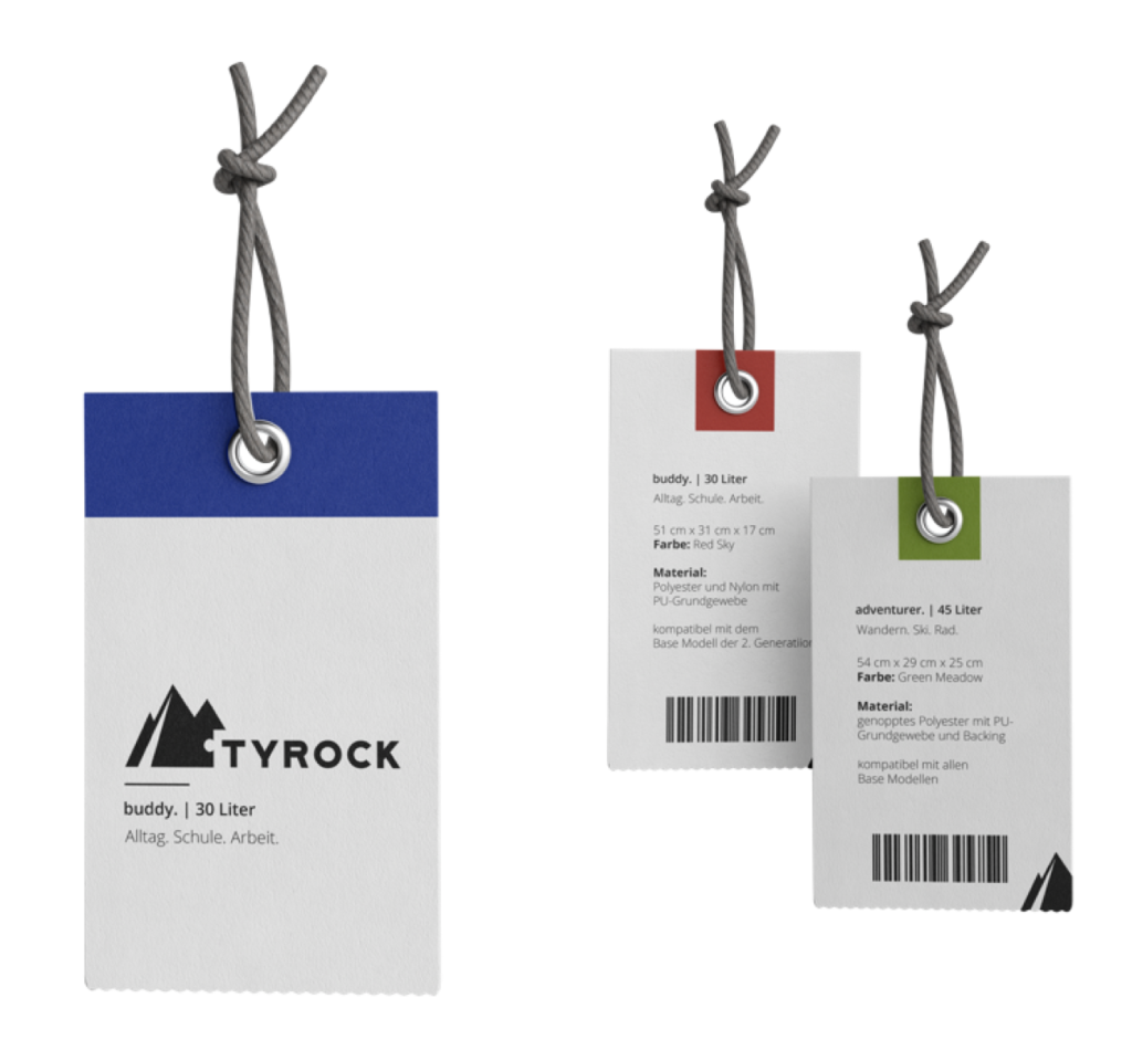
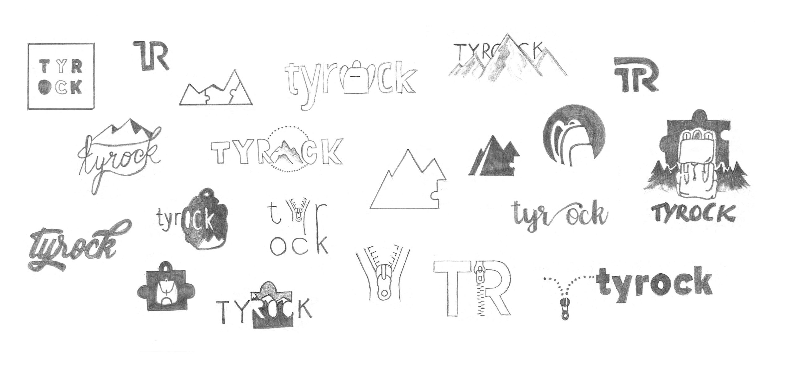
The startup specializes in outdoor products and would like to achieve a down-to-earth, adventurous, honest and strong impression. Furthermore, the brand should reflect the connection with nature and the mountains. The name Tyrock consists of “Tyrol” and “Rock”. The product of the company Tyrock is the modular backpack, which consists of a basic unit with straps and a backplate. Depending on the use, various extensions can be attached to this base unit.

Look & feel

bold typography and clean design

The branding requirements were a clean and strong appearance. With the bold typography, the name of the company is carried outside – nonetheless it is always supported by a signet. The mountain, cleverly combined with a piece of the puzzle, symbolizes the relationship to nature and the modular components of the product at the same time.

The logo is primarily used in black, but a complementary accent color was chosen. The strong blue once again reflects the relationship to nature – the vast blue skies in alpine terrain and the strong blue tones in natural waters.

The new brand in action

A challenge in this project was to design the packaging. Since this is a fictional product, it was difficult to work off of it directly and backpacks are rarely bought packaged anyway. I have therefore focused on the design of a box that can be used for a potential online shop. The backplate or the modules of the modular backpack are put in a cloth bag for additional protection during shipping. These bags are made out of sturdy fabric and therefore sustainable and reusable. Of course the bags and the boxes reflect the overall branding.

In addition, every product has a label. On the clean front is just the Tyrock logo accompanied by the accent color. All product details can be found on the back. Where the blue accent color was used on the front, the actual color of the product is now reflected above the product details. 

Furthermore, advertising measures were designed in the form of large-format posters. Ideas were also collected for the startup’s potential social media presence.

Client/Context

FH St. Pölten

Master Digital Design

Masterclass Graphic Design

Time

Winter 2019/2020

Used Tools