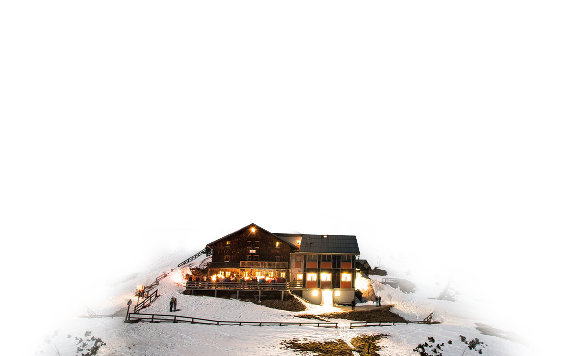
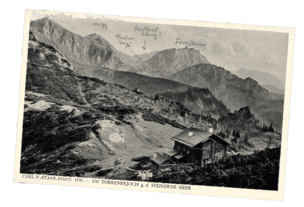
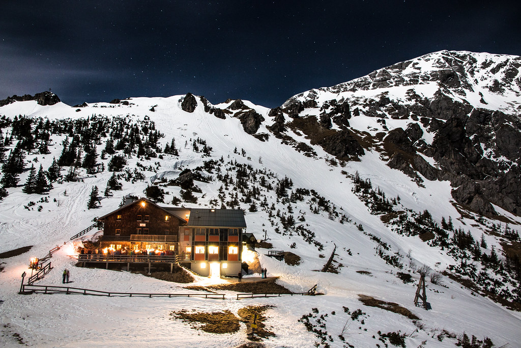
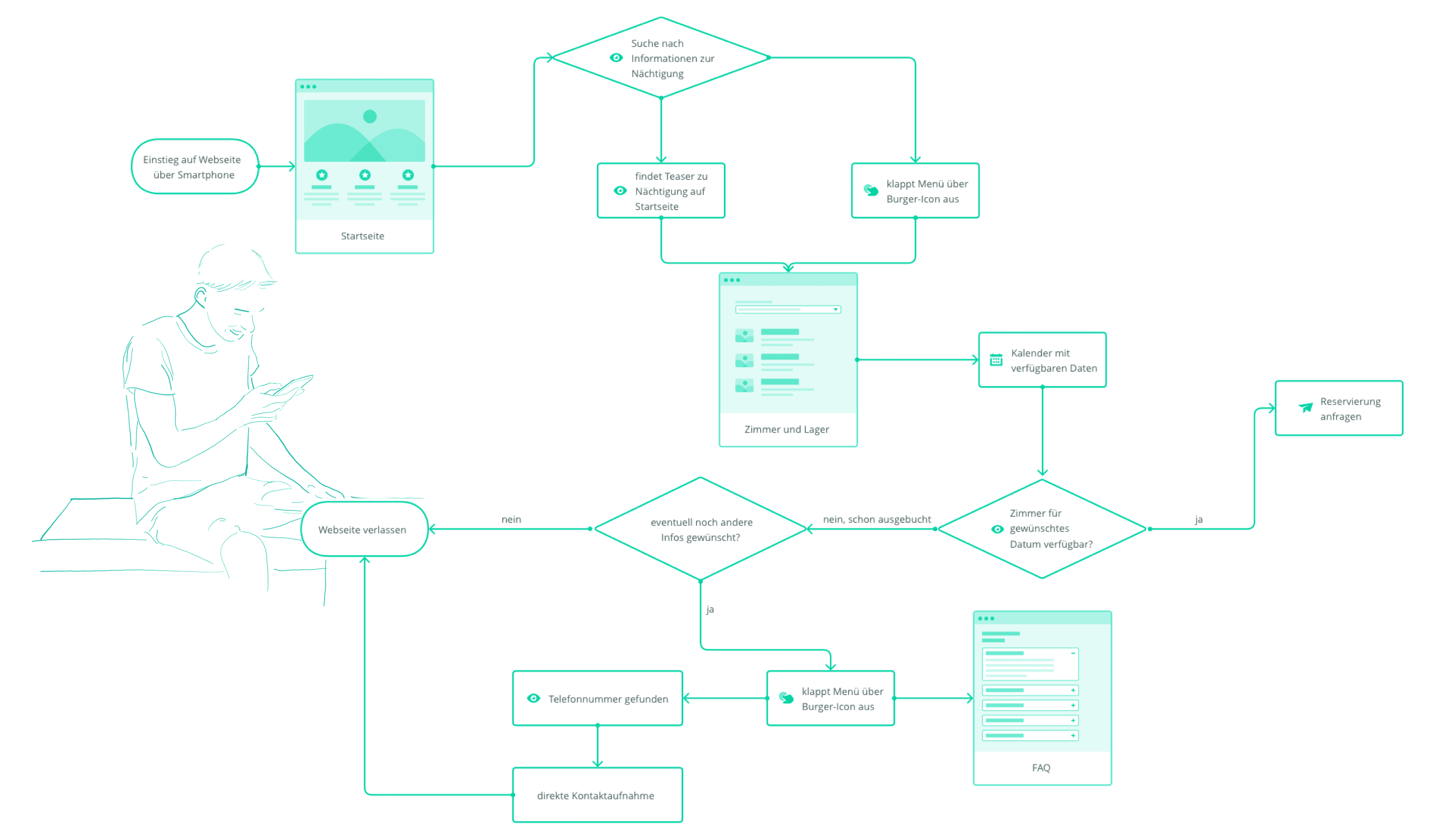
Carl von Stahl Haus

1.733m | seit 1921

Carl von Stahl Haus

As part of a case study, a new brand identity and a modern website were designed for the “Carl von Stahl Haus” – an Alpine Club hut of the Salzburg section of the Austrian Alpine Club (Alpenverein). The focus here was on the design process of a user-centered website. This project was designed as part of a univeristy course and has no direct connection to the Carl von Stahl Haus.

The hut is located at 1,736m altitude on the Torrener Joch, between the Hagengebirge and Göllstock. The border between Bavaria and the Austria state of Salzburg runs right in front of the peremises. Due to its easy accessibility, the hut is a popular destination for hikers and day visitors, but also a valuable starting point for mountaineers who undertake longer tours from here. Exciting tours are not only offered for hikers, also climbers and ski tourers get their money’s worth! The Carl von Stahl Haus, right on the German-Austrian border, is one of the few mountain huts in the Eastern Alps that is open all year round.

The business and brand

At the beginning of the project, I analyzed the existing brand and website. During the analysis of the website, I was able to identify some problems which were ultimately the starting point of my redesign. The existing website had the logo of the alpine club, but no branding of its own. The website uses an inconspicuous sans serif font, everything is kept in shades of gray. The way that the content of the page is framed makes it look very dated. The general structure is the same on all pages: all content is located in a content box, which is always adorned with the same photo in the upper area.  The strictly consistent appearance makes orientation difficult

Understanding the users

Target group

Nature enthusiasts whom are planing their next adventure are the main target group of the Carl von Stahl Haus website. The website should be inviting, but also informative – it should create a feeling of security, trust and competence.

For spontaneous vacationers, lost adventurers and everyone else, a mobile implementation is a must! In order for the redesign to appeal to a respective target group, three representative personas have been developed. 

Personas

In the user centered design process, as the name suggests, the focus is on the end user. In order to create the most efficient and successful user interface (and in this context also user experience) one must first deal with the question who the potential audience will be. It is important to think as broadly as possible so that many different scenarios can be covered, in the end: virtually every scenario should possible. Fictional personas and application examples were developed as the next step in the project.

Use cases | Conclusions

As part of the case study multiple use cases have been created and run through. This allows a designer to gain valuable insights into the needs of the target group. The most important findings are presented below.

  • Responsive implementation

    The smartphone is often the only interface, especially in the outdoor area - a perfect mobile version is therefore essential

  • FAQ

    Good summary for further information, if this is not described on the respective sub-pages

  • Maps & routes

    Important for all those who are not from the area and want to explore nature safely

  • Photographs

    Important so that you know what to expect and what you are actually spending money for

  • Live informations

    It is not only important to provide information about the accommodation itself. A weather forecast can be very helpful, especially on the mountain where the weather can change very quickly and unexpectedly

Planing the User Experience

Once one has dealt with what the users will need, the next step is to think about how  to arrange this necessary content. Maybe it makes sense to combine certain elements? What priority do the individual areas and subpages have? With the help of card sorting and a sitemap, possible solutions can be visualized. They are also a good base to start a discussion and evaluation. During the design process it is also advisable to continuously run through some of the previously defined scenarios in order to find suggestions for improvement.

User Flow

The user flow is the path that a prototypical user takes on a website or app to carry out a specific task. The user flow takes them from their entry point through a series of steps to a successful outcome and final action, e.g. buying a product.

Sebastian’s Use Case

Sebastian has been in the mountains with his two friends for three weeks now, they are enjoying their summer. When they visited the Gollniger waterfall, they found out about the Carl von Stahl Haus and would like to go up two days later and then continue their adventure in Germany.


  • would like to book accommodation
  • checks availability
  • is looking for a way to get in touch quickly

The Brand Experience

A new, modern and eye-catching color palette clearly sets the redesign apart from the competition. Clear icons ensure clarity and good orientation. With the help of high-quality and inviting photos, athletes and hut lovers are attracted. Helpful, but nonetheless decorative icons, ensure good and simplified orientation through the website.

Moodboard

A mood board creates and summarizes the aimed at atmosphere and feeling. Initial ideas can be conveyed in an appealing presentation and induce feelings.

Logo

The modern geometric logo reflects the triangular shapes of mountain peaks and roofs. Calvert, the slab serif font in use, is a perfect compromise between modern grotesque and traditional serif fonts.

Stylescape

A stylescape is a collection of selected images, design elements, fonts, textures and colors that help define the visual language.

UI Prototyping

Low Fidelity Prototyping

Low-fidelity (LoFi) prototyping is a quick and easy way of converting higher-level design concepts into tangible and verifiable artifacts. The first and most important role of LoFi prototypes is to verify and test the functionality, not the visual appearance of the product. The use case “Peter’s Family Trip” was used to generate initial ideas.

Peter has just processed the last business e-mail for this week and can now start the weekend. Not much is planned, but he would like to go on another trip with his family soon. He’s already sitting in front of his laptop anyway and decides to browse through a few blogs for recommendations.

The following pages were created:

  • Home page
  • Tours
  • Tour subpage (detailed view)
  • FAQ

High Fidelity Prototyping

Prototypes with high fidelity (HiFi) simulate a user interface so faithfully that these models can be sometimes perceived as real. They are similar to mockups (draft pages that already look like the finished application), but the HiFi prototypes differ in the additional interaction options, which means that the functionality of the application can be displayed and subsequently tested.

In the first step of the high fidelity prototype, the same use case as for the LoFi version was used and developed. Design components were implemented that were previously defined and visualized in the stylescape. In further steps, another use case was implemented and a mobile version was also designed.

User Testing & Evaluation

In a usability test session I asked a participants to perform tasks. As the participant completes each task, I observed the participant’s behavior and waited for feedback. The goals include: identifying problems with the design of the product or service, discovering opportunities for improvement, and learning more about the behavior and preferences of the target users. The participants are often asked to think aloud during the usability tests (so-called “think-aloud method”). I asked the participants to share their thoughts and actions while completing tasks. The aim of this approach is to be able to better understand and understand the behavior, goals, thoughts and motivations of the participants.

Important insights

Testing with potential users highlighted deficiencies that I was able to understand through their argumentation and implement accordingly.
On the one hand, the test persons asked for specific descriptions of the images in  sliders, so that it is clear from the photos, for example, which room category it is.

Further, the availability calendar was misunderstood because of the colors that have been used. The colors should visualize the business and booking capacities, but the rectangular shape gave the impression of buttons.


Final results

In the course of the project, feedback was repeatedly obtained. Not only in the context of user testing, but also in the teaching units. All the knowledge and inputs collected were evaluated and further processed. The final versions of the two prototypes can be viewed under the links below.

Client/Context

FH St. Pölten

Master Digital Design

Masterclass Graphic Design

Time

Spring 2020

Used Tools