Tomáš Baťa University in Zlín has a Faculty of Multimedia and Communication which consists of several study programs. At the end of each academic year an exhibition is organized which presents mixed works from the departments such as graphic design, photography, glass design and others.
For this event called Diplomky (Czech slang for diploma thesis) a branding is annualy developed from scratch: on the one hand there is an exhibition which is also promoted in the city as well as online. On the other hand, a printed catalogue is always published in which all the works are presented. During my semester abroad I participated in the design process of that catalogue. On this page I present my concept, which would also be adaptable for e.g. advertising material.
The design concept
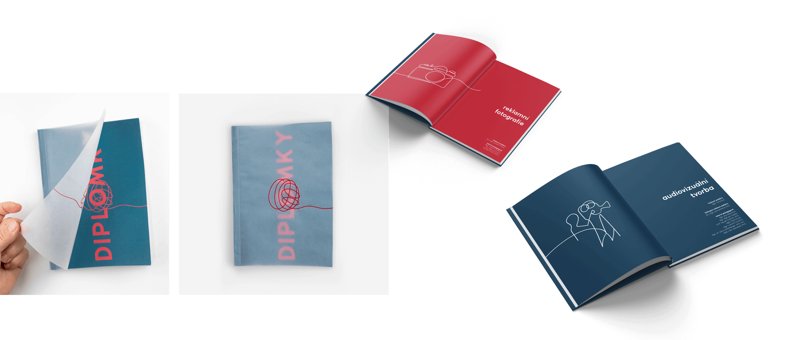
A solid line is the connecting element throughout the book which presents the final graduation projects. One-line-illustrations were created for each department. The cover is simple and shows one symbolic ball of wool as the origin of the line: symbolizing the similarities and bond between the different studies at the faculty of Multimedia Communications at TBU Zlin.
The format of the catalog is predefined. As part of the graphic design studio I had the opportunity to look at copies from previous years. In summary, they always had something special: be it the paper texture or, for example, an embossing on the cover. Despite the same format, they always stand out from each other In view of the past years, a special type of paper and printing was also chosen for this edition. At the end of the project a physical prototype was made, which made this concept tangible.
Catalogue Layout
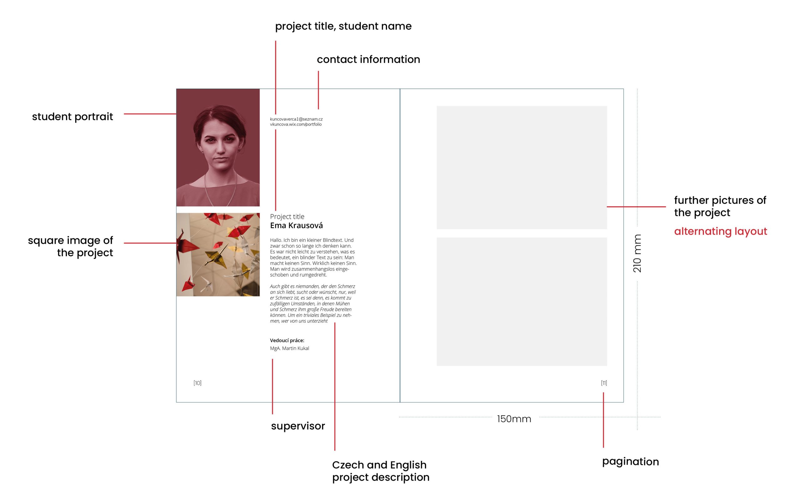
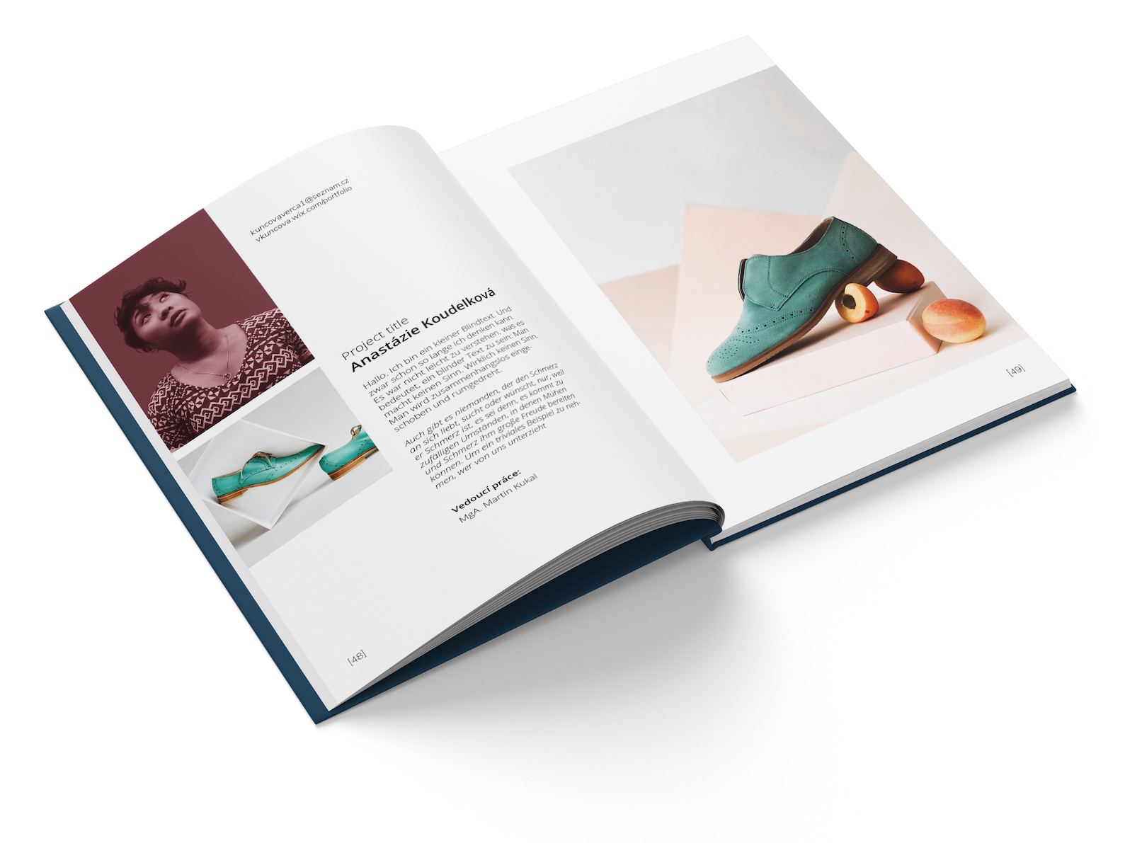
In terms of content, there were specifications as to what information must find space. For my portrait concept (which will follow) it was necessary that the photos are always in the same place. I decided to make the left page the same for all students, as this also makes it easier for readers to find their way around when they quickly flip through the book. Depending on their preference and project, the students can present their work with more or less photos on the right page.
Color concept | student portraits
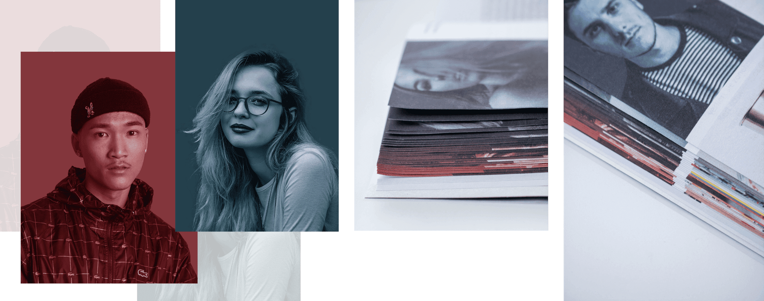
The color concept consists of a bold combination of two primary colors and utilization of the gradient palette between these two colors. A color filter is used on the portraits to make the photos interesting without interfering with them too much. Each overlay is based on the color from the gradient which was assigned to the department. This creates a subtle gradient throughout the book. The portraits are taken in front of a clean background, preferably grey to achieve the best color-overlay in the editing process.
The poses don’t have to be the same. This way the students that are being photographed have the opportunity to show their personality.