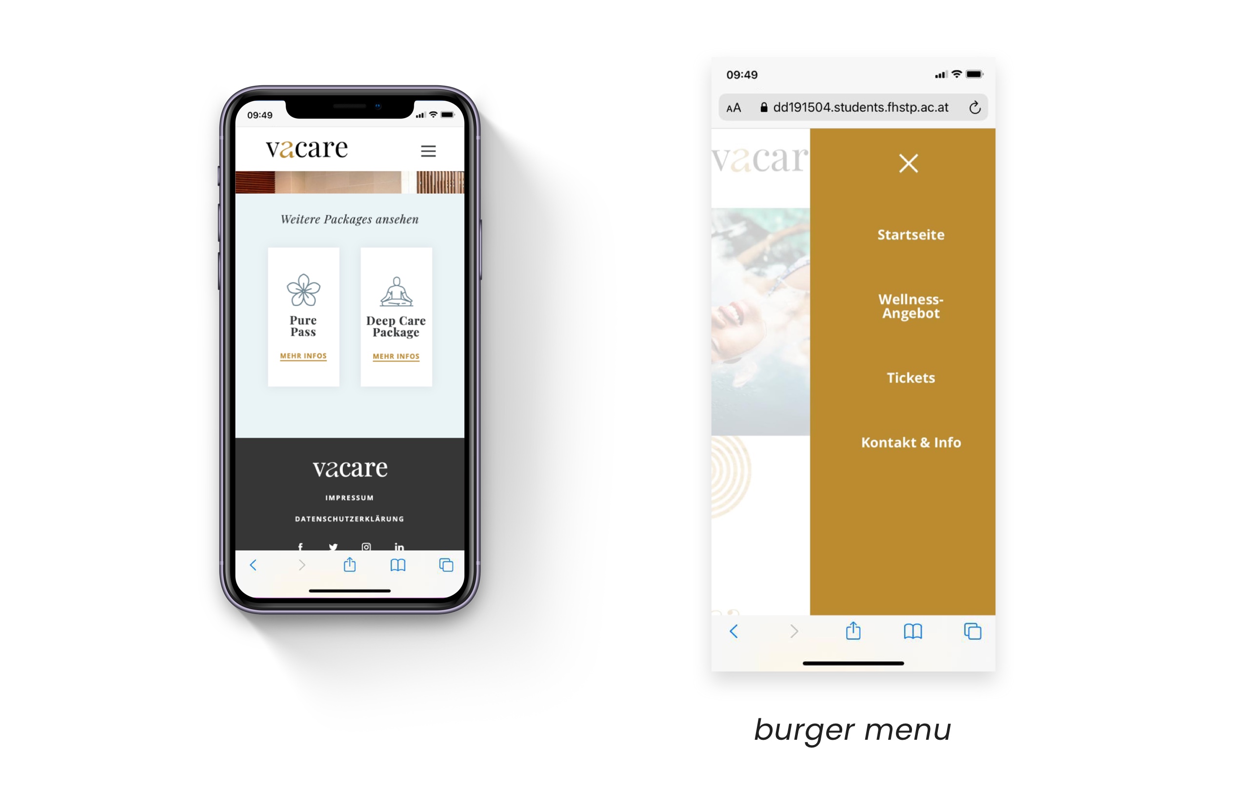
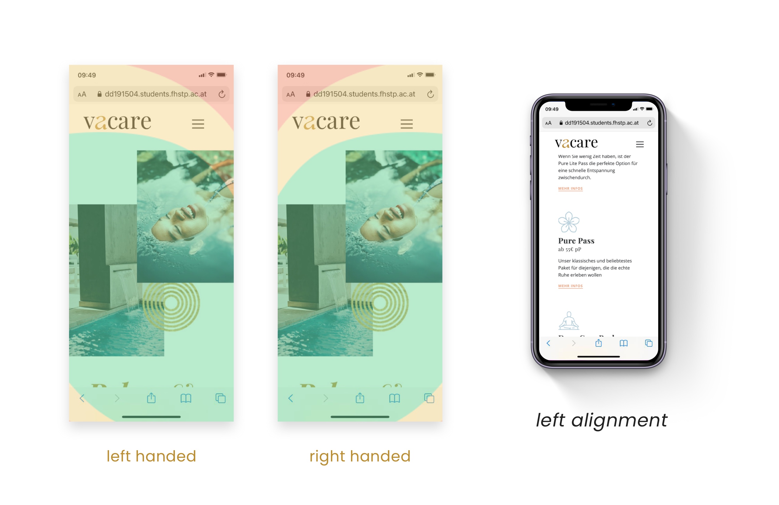
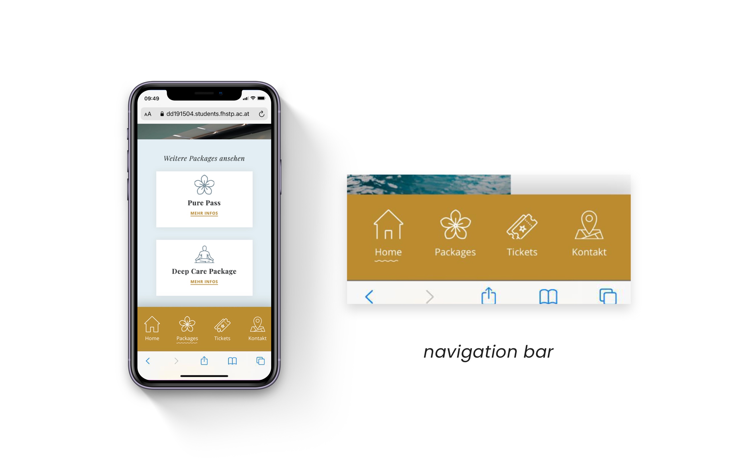
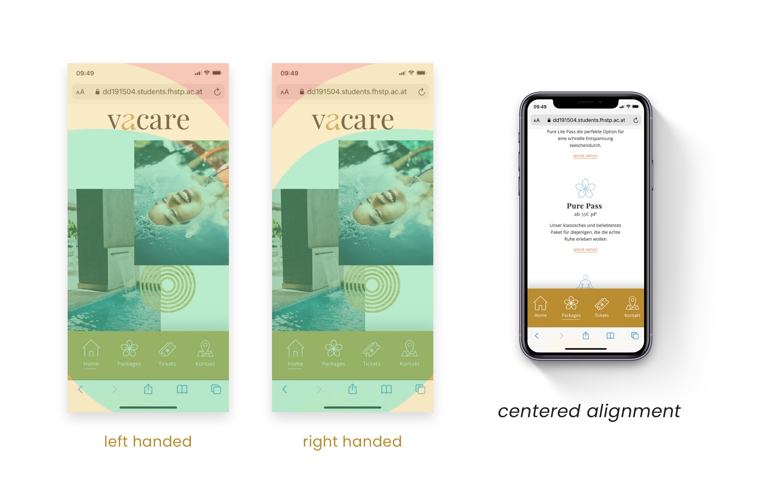
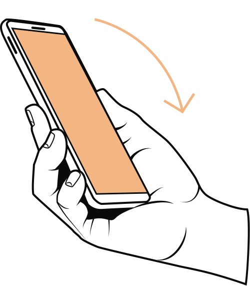
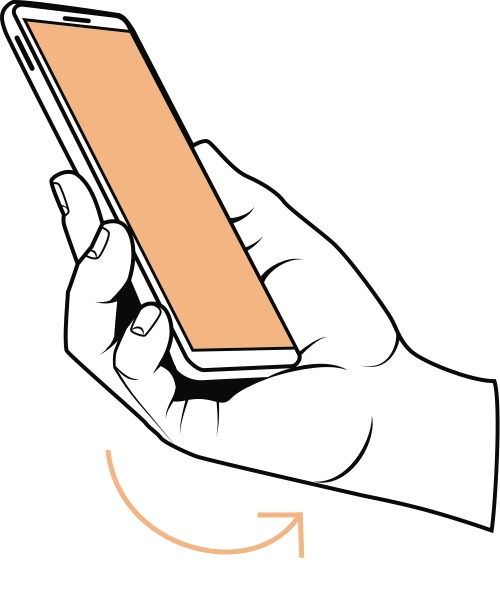
Differences in usability of mobile user interfaces for left- vs. right-handed users​

UX research study examining how left- and right-hand use affects mobile interface usability. Based on A/B testing and System Usability Scale (SUS) evaluation, the project translates empirical findings into practical design guidance.

Project type: Master’s thesis (graduated with distinction)

Role: UX Research & Design

Institution: UAS St. Pölten – Master Digital Design

Recognition: Golden Wire Award 2021, 2nd place in Graphic Design

🔗 Full research thesis (German)

Research Challenge

Many mobile interfaces are implicitly designed with right-handed use as the default, despite a significant portion of the population being left-handed or switching hands depending on context. This design bias can lead to reduced comfort, limited reach, increased cognitive and physical effort, and inconsistent usability outcomes across user groups. In everyday mobile use, even small layout decisions — such as navigation placement or interaction zones — can significantly affect efficiency and perceived usability.

The core research question guiding this study was: How does hand preference influence usability in mobile interfaces, and what design adjustments can improve accessibility, comfort, and effectiveness for both left- and right-hand users?

Study Design & Methodology

Participants completed guided navigation tasks on both prototypes.
Data collection combined quantitative usability measurement with qualitative behavioral observation.

Prototype A — Hamburger Navigation

Prototype A uses a traditional hamburger menu, with primary navigation elements placed in the upper and side areas of the interface. This common pattern requires extended thumb reach and often leads to grip adjustments during use. It served as a baseline to observe posture changes and compensatory interaction behavior.

Prototype B — Bottom Navigation

Prototype B implements a fixed bottom navigation bar, positioning primary actions within natural thumb reach for both left- and right-hand use. Navigation items are persistently visible and clearly labeled. This prototype tested whether improved reachability leads to more stable interaction patterns and higher perceived usability.

Key findings

  • Higher perceived usability was recorded for the bottom navigation prototype across both left- and right-hand users.

  • More frequent grip changes and device tilting occurred when interacting with the hamburger menu.

  • Bottom navigation supported more stable hand posture and reduced the need for reach compensation.

These results indicate that navigation placement has a measurable impact on comfort and user experience, independent of content.

Left handed users
vertical tilt

prototype A: 4 out of 5 users
prototype B: 0 out of 5 users

horizontal tilt

prototype A: 3 out of 5 users
prototype B: 1 out of 5 users

Right handed users
vertical tilt
prototype A: 4 out of 5 users prototype B: 0 out of 5 users
horizontal tilt

prototype A: 1 out of 5 users
prototype B: 2 out of 5 users

Insights & Design Implications

Based on the usability study and the final design guide of the thesis, the following insights summarize how navigation patterns influence mobile interaction.

  1. Interaction placement affects posture and experience
    The position of key UI elements influences device grip, the need to change hand position, and overall usability.

  2. Bottom navigation supports frequent actions
    Placing top-level destinations at the bottom of the screen improves reachability and one-handed comfort.

  3. Burger menus are needed for complex structures
    For multi-level or content-heavy interfaces, expandable menus or hybrid navigation patterns remain necessary.

  4. Touch targets require size and spacing
    Adequately sized and well-spaced interaction areas reduce erroneous input and support confident use.

  5. Usability testing should include hand preference
    Accounting for different interaction habits, such as left- and right-hand use, reveals usability issues that may otherwise be overlooked.