Sylwia Cioch-Adamczak is a physical therapist in Vienna with more than 25 years of experience. She approached me to relaunch her website and develop a cohesive brand system that could scale across digital and print touchpoints.
The goal was to modernize a website that hadn’t been updated in about a decade and reposition the practice with a more professional, trustworthy external presence for prospective patients. I led the work end-to-end across brand refinement, print design, and website structure/content flow.
Client: Sylwia Cioch-Adamczak, Physical Therapist in Vienna
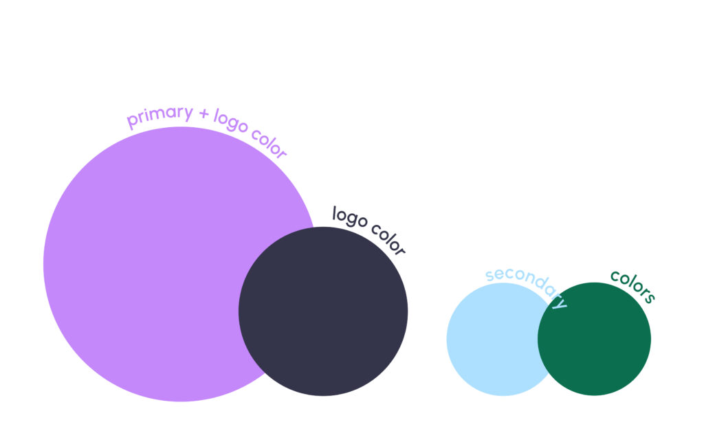
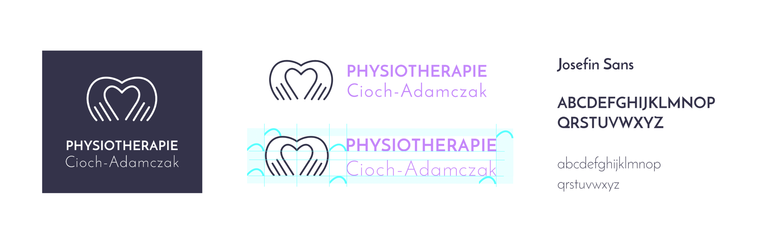
A refreshed color palette was developed based on the existing look. The distinctive purple was intentionally retained to help the practice stand out in a typically conservative medical landscape, but it was refined into a more contemporary tone and expanded with supporting colors for consistent use across print and web. The logo mark was inspired by manual therapy and hands-on treatment, translating the practice’s core method into a simple, recognizable visual.
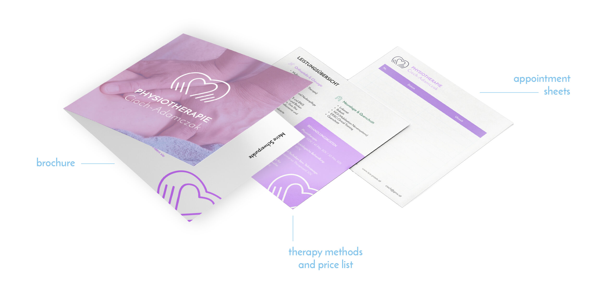
Patient-Facing Print Materials
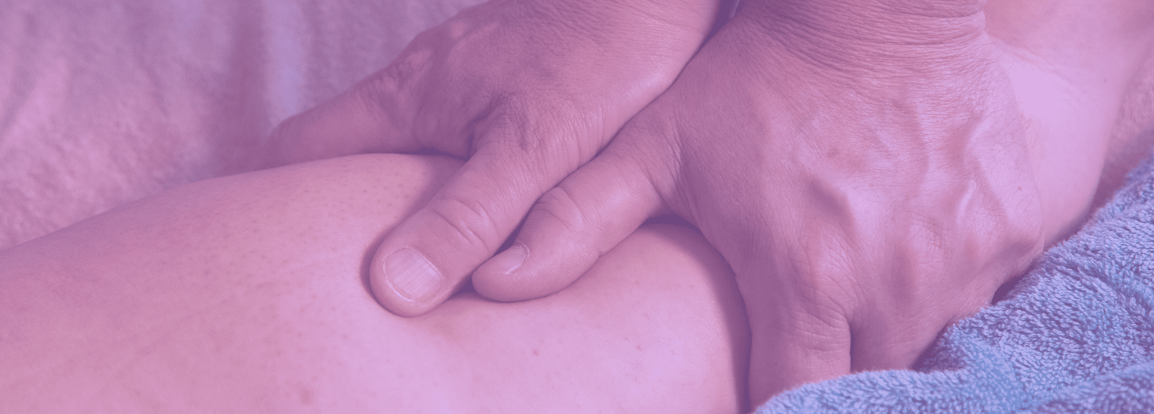
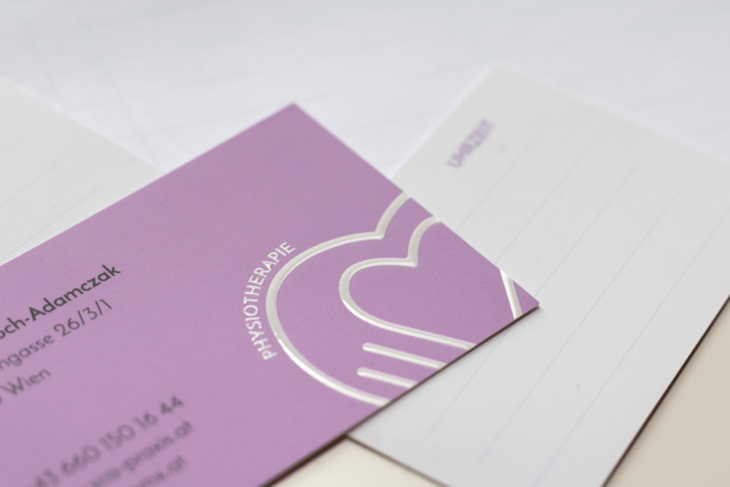
The print materials were designed as an extension of the brand system, ensuring consistency and clarity across patient-facing touchpoints. A unified square format was used for appointment sheets, brochures, and price lists to create a cohesive and easily distributable set. Business cards were produced with a special tactile coating, adding a subtle sensory quality that reinforces the hands-on nature of physical therapy while elevating the perceived quality of the brand. Typography, color, and iconography were applied consistently to support quick orientation and professional credibility.
Website relaunch
The website was fully restructured to support common patient questions—treatments offered, suitability, location/directions, background, and insurance coverage—while reinforcing trust through practice imagery and clear content hierarchy. Calls-to-action were placed deliberately across subpages to support a smooth user journey, and motion elements (background videos) were used to subtly communicate mobility and recovery.